At Morning Consult, as part of a 2 person team of Data Visualization Designers, we created a Data Viz Style Guide to help content creators (Analysts, Reporters, Developers, other Designers, etc.) build their own charts with brand styles and best practices in mind. We launched the Style Guide through Notion (our repository for documents, resources, collateral, etc.) for easy updating and company-wide dissemination.

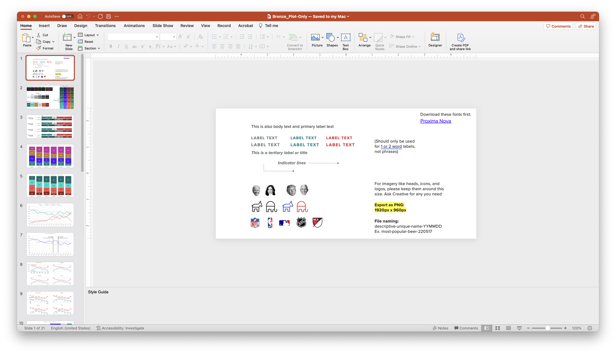
The Style Guide covers overall guiding principles when approaching data viz, key considerations, definitions of chart elements, how to use color, different chart types and when to use them, table styles, dimensions for building and exporting, typography, a brief overview of accessibility considerations (my co-designer built an entire Accessibility guide that is linked to from here), and a list of helpful internal resources. I’m happy to share the style guide upon request.
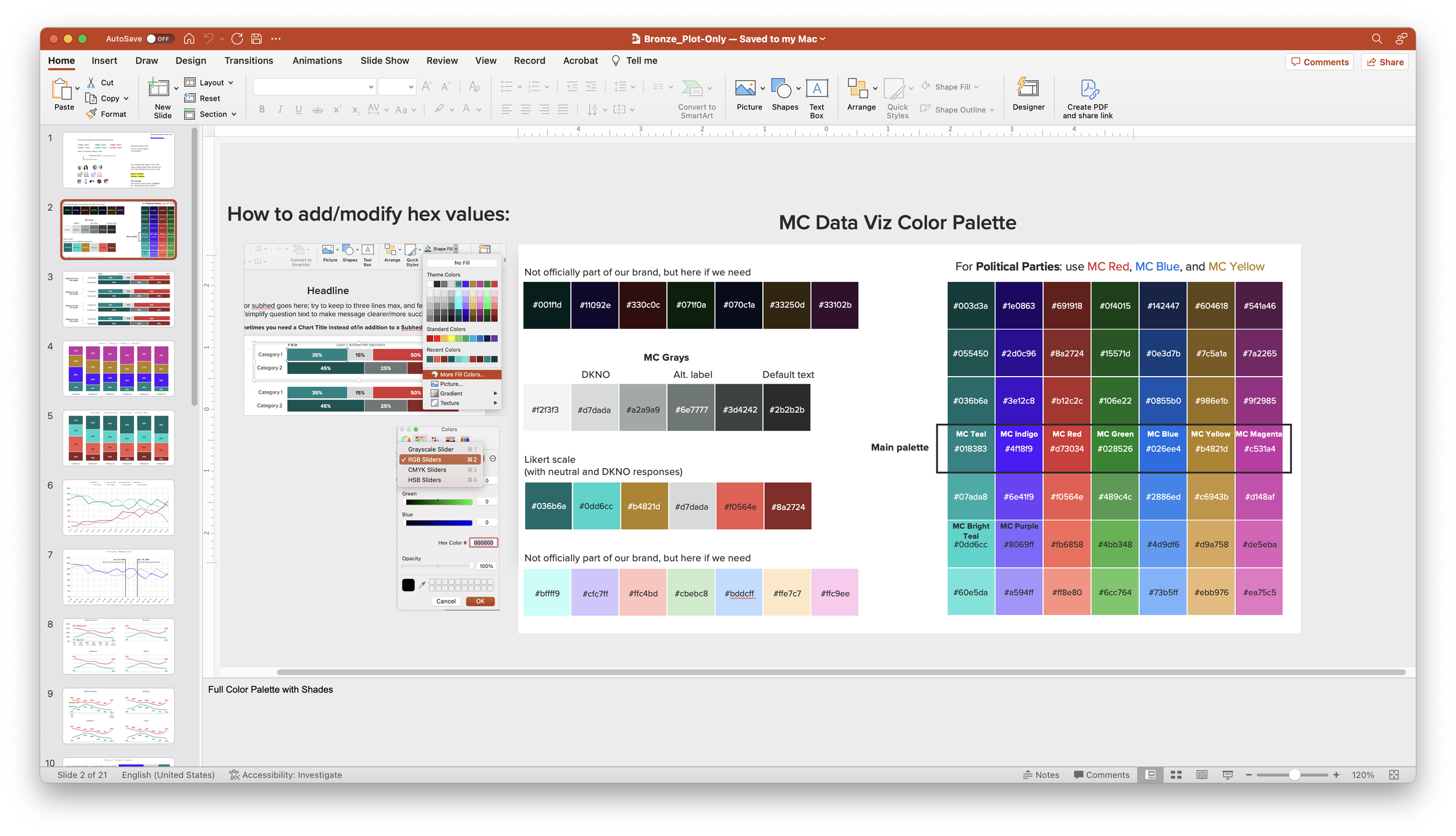
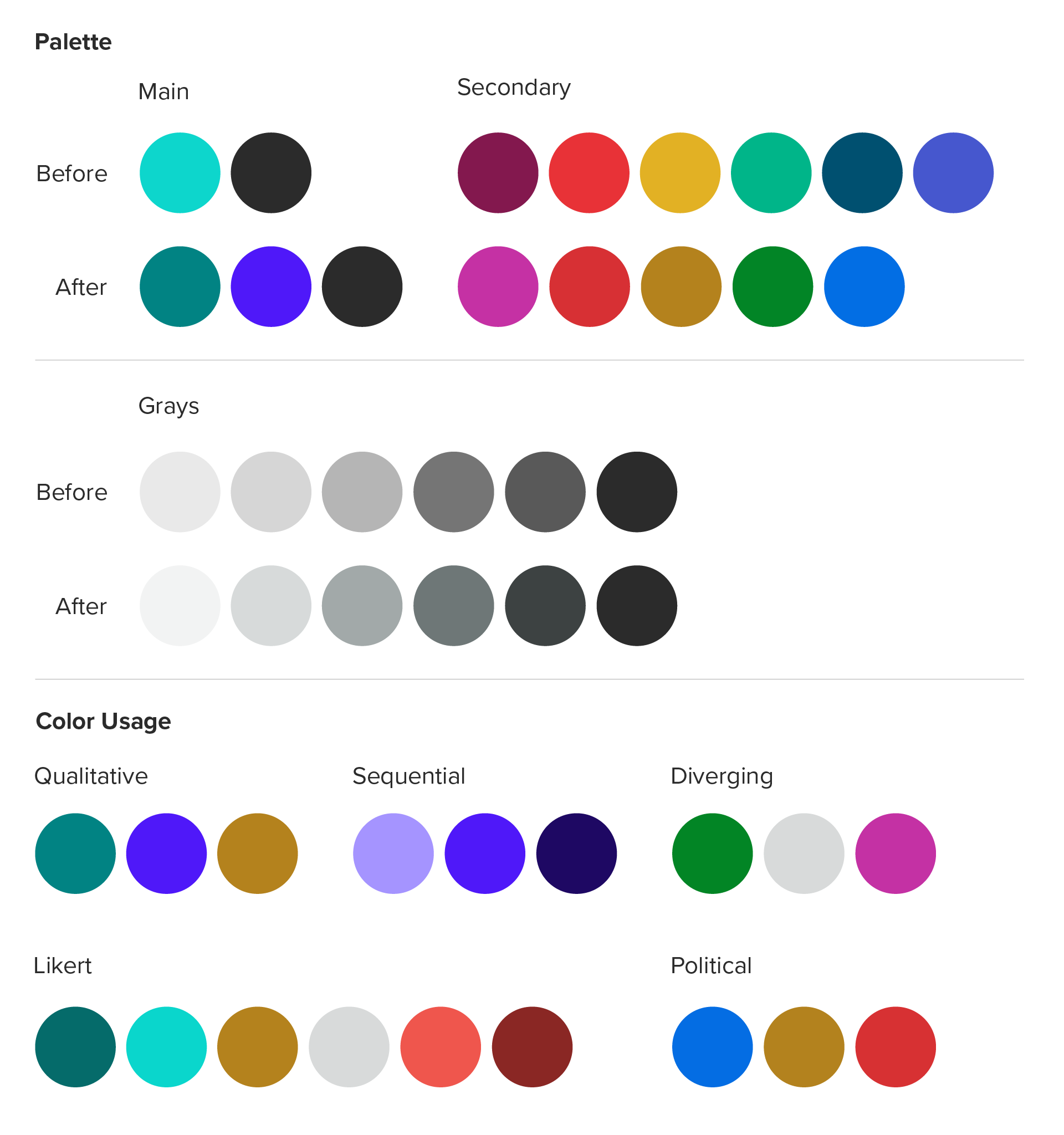
In 2022, the Morning Consult brand went through a refresh. One of the biggest pieces of that refresh was adapting our color palette to be both brand and data viz friendly. I spent a lot of time researching color, accessibility, and how to set up a color palette specifically for data visualizations. I also had to work within several constraints from the visual design team, since they were also working on color from an overall brand perspective. This meant that what they established as the “main palette” could not change; and instead, the secondary palette (used predominantly for data viz) needed to support it. Contact me if you’re interested the tools I used to propose the new colors.
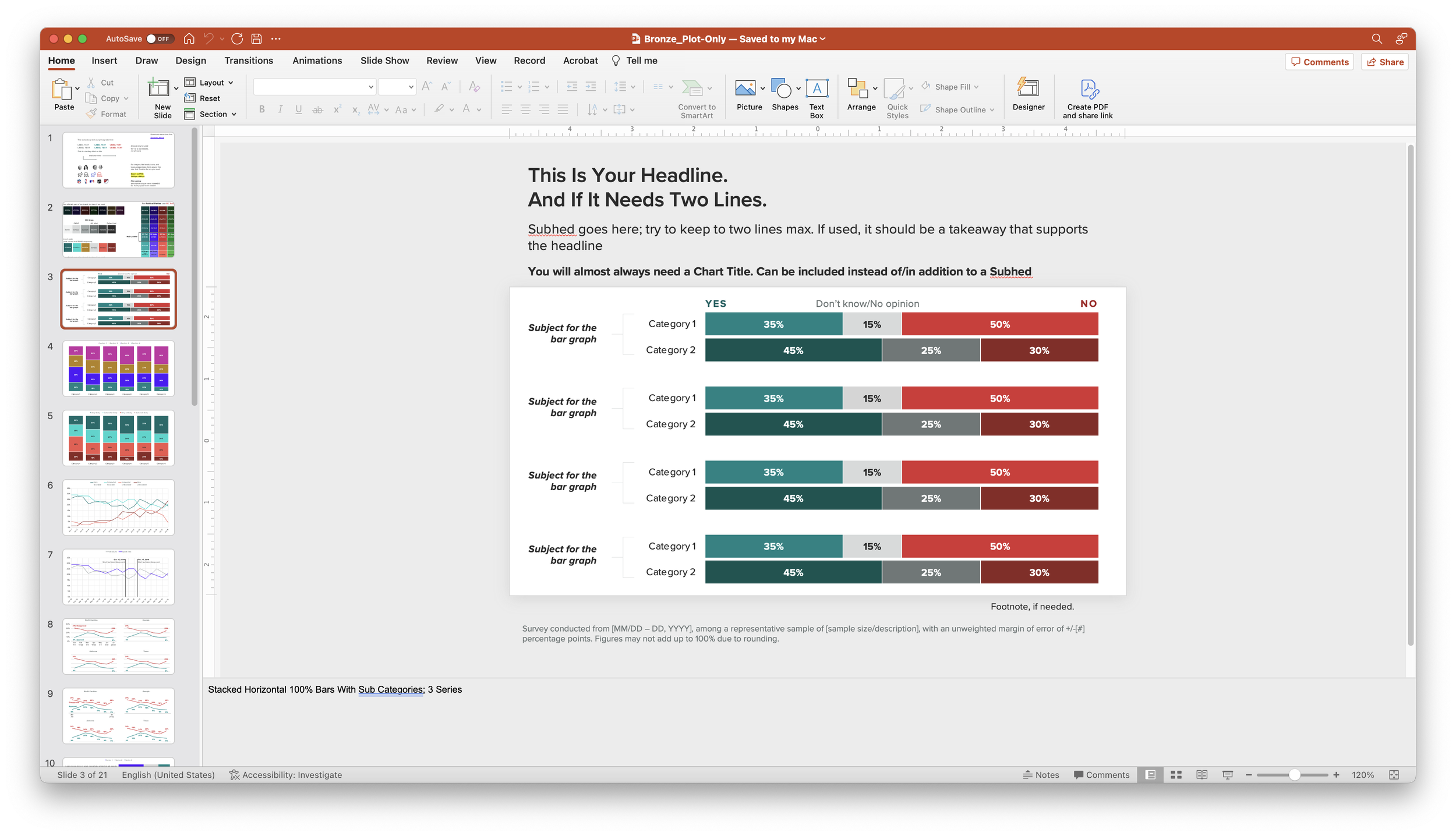
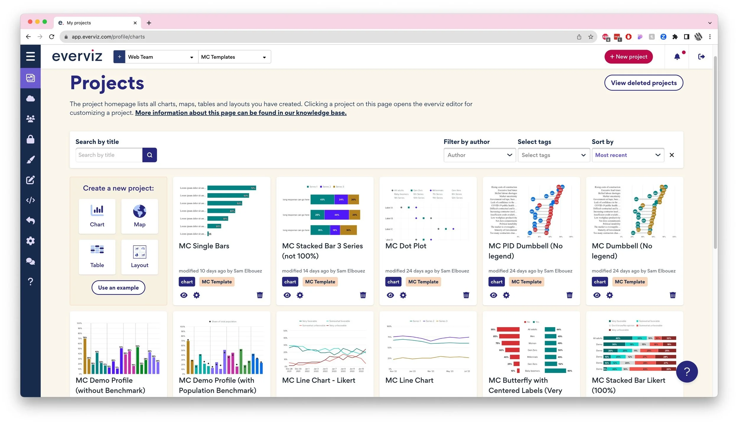
We also created, maintained, and improved templates for building charts using PowerPoint and an interactive chart-builder, everviz. Creators have the option to build a static chart, starting from one of seven PowerPoint files that we set up (each with 10-20 slides, varying in type and complexity); or to build a dynamic, responsive chart using one of 34 templates in everviz.